Context
When editing a new blog post on Steemit.com, the layout is a bit annoying with the text editor at the top and the preview at the bottom. It makes editing posts difficult because you have to keep scrolling up and down to see the preview and go back typing.
@stoodkev has introduced a side-by-side editing / preview in his SteemPlus, Chrome extension, that modifies Steemit.com pages on-the-fly. However, the release of Communities has broken few features including the side-by-side editing. This was the trigger for me to finally have a look at it and implement a built-in feature.
The work done
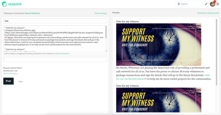
To achieve the layout I had to modify both the DOM and the CSS that controls the editor in order to re-arrange the layout and make it responsive (make it adapt to all screen sizes).
Here is the desktop version:

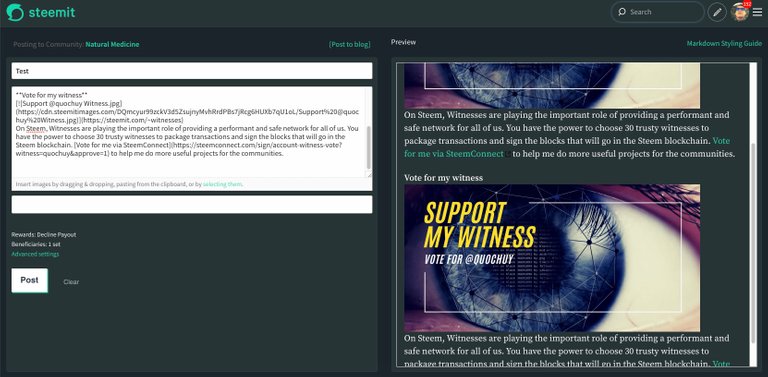
It also works in night mode:

In narrow screens, the preview pane behaviour is unchanged and will sit below the editor.
I also had to modify the files for the comment editor as they share the same editor logic. When creating a comment, there will be no side-by-side feature but there is a slight change in design as seen below:

Steemit Condenser Pull Request
This feature is not out yet, a pull request has been created:
https://github.com/steemit/condenser/pull/3722
Once approved and merged, it will be available in a future release by Steemit Inc.
Vote for my witness

On Steem, Witnesses are playing the important role of providing a performant and safe network for all of us. You have the power to choose 30 trusty witnesses to package transactions and sign the blocks that will go in the Steem blockchain. Vote for me via SteemConnect to help me do more useful projects for the communities.
